Multiple linear regression
In this practical we will look at using linear regression to estimate associations between any type of covariate and a continuous outcome.
Rationale
Uses
Linear regression can be used for description (particularly to describe associations), causal inference or prediction. Here we will just look at using it for describing associations, which typically means using separate models to describe each association of interest, as we do not want to adjust for other covariates. You can read more about the rationale behind this broad approach in this excellent recent framework for descriptive epidemiology: https://pubmed.ncbi.nlm.nih.gov/35774001/
Key terminology and concepts
If necessary please read the below guide to key terminology and concepts before reading further as we will be using these terms when discussing linear regression and the modelling process in SPSS without further explanation.
Model = Loosely speaking: the outcome variable and the set of covariates that you are analysing via linear regression, plus their functional form (see below). Note: although simpler analyses like the independent t-test are referred to as “statistical tests”, creating the false illusion of a fundamental difference from regression “modelling”, they have the same underlying mathematical form. Simply put, parameteric statistical tests like the independent t-test are models too.
Coefficient or parameter or (model) term = The point estimate measuring/indicating the direction and size of the association between a given covariate and the outcome that your linear regression estimates.
Functional form/model parameterisation = In what mathematical form you add covariates to your model. Practically speaking this is whether your model assumes 1) a simple linear association between a given covariate and the outcome (also called a “main effect”), or 2) an interaction between a given covariate and one or more other covariates and the outcome, or 3) a non-linear association between a given covariate and the outcome (although many other functional forms are possible).
Practice
Scenario
We wish to describe important associations between key socio-demographic and relevant health related characteristics and individuals’ systolic blood pressure using the data collected in the SBP final dataset. As these are descriptive research questions and we want to describe the associations of interest as they exist, we will use repeated linear regression models where we model the association between each characteristic (covariate) of interest without adjusting for any other covariates. This will produce unadjusted or crude associations that reflect the associations as they appear without any assumption that they may reflect causal associations. One or more of these associations may of course reflect causal associations, but it’s unlikely they will be good (accurate) estimates of causal associations because this is an observational study so adjusting for the inevitable confounding effectively, and without making potentially worse mistakes like introducing collider bias, is a huge challenge that is beyond the scope of this module, but see the materials in the linear regression lecture on Minerva for an introduction to the complex world of causal inference using observational studies/data.
Exercise 1: describe the population-level association between bmi and systolic blood pressure using linear regression (assuming a linear association)
- Load the “SBP data final.sav” dataset.
Step 1: explore the data
Written instructions: explore the data for a linear regression
Read/hide
It is always advisable to conduct some focused exploration of your dataset to understand the data and the guide certain decisions in your model building process. Note: this would follow your data preparation stage, where you would already have a good sense of the key characteristics of each variable, such as the type of data it contains, the range of values present etc.
It is usually recommended to thoroughly explore you data in terms of: 1) the distribution of your outcome and covariates, to ensure you understand them well and are taking a suitable modelling approach (e.g. linear regression rather than another type of regression), and 2) what functional form of model makes good sense given the associations between your independent and outcome variables, primarily whether there are any clear/strong non-linear associations or interactions, although we will not look at exploring interactions in this practical as they are beyond the scope of this course. Again, see the linear regression lecture additional materials on Minerva for some introductory information on this.
Univariate exploration
To understand the distribution of your variables you can use histograms for numerical variables and bar charts for categorical variables. Let’s run a histogram for our outcome variable.
- From the main menu go: Graphs > Histograms. Add sbp into the Variable: box, tick the Display normal curve box and click OK. What do you see?
What does the distribution of the outcome look like?
Read/hide
There appears to be a slightly odd “gap” near the mean, but overall the variable appears to pretty closely follow a normal distribution.
Next let’s look at a bar chart for our ses variable.
- From the main menu go: Graphs > Legacy Dialogues > Bar. Then click the Simple option and Define. Add ses to the Category axis: box, tick the % of cases option and click OK. What do you see?
What does the distribution of the socio-economic status variable look like?
Read/hide
Most participants were of low socio-economic status, with successively smaller proportions being of medium and high socio-economic status.
You can use these two types of graphs to explore the distribution of all the variables. In a real analysis you would certainly want to do this, but for the sake of time you may want to move on now that you know how to do this.
Bivariate exploration
Numerical covariates
First let’s look at associations between the outcome and numerical variables (i.e. bivariate associations) to understand whether it’s reasonable to assume simple linear associations for your numerical covariates or whether any need to be modelled via the addition of non-linear terms to the model. We’ll just look at bmi as this is our focus for this exercise, but we’d do this for all numerical covariates in practice. We’ll use a scatterplot.
- From the main menu go: Graphs > Legacy Dialogues > Scatter/Dot. Then select the Simple option and click Define. Add the sbp variable into the Y Axis: box and bmi into the X Axis: box then click OK. What do you see?
What does the association between bmi and systolic blood pressure look like?
Read/hide
There’s a clear linear association displayed here.
What if we had seen a clear non-linear association? See the additional materials on the Minerva lecture folder for more info, but in brief there are two main options within a regression modelling framework:
Convert your numerical covariate into a categorical variable.
Include additional “polynomial” terms of the relevant covariate. This just means that as well as including, say, age in the model you include age² or possibly higher-order terms as well.
Option 1 is often the best choice because although it might not model the association as well as option 2 it provides results that are easier to interpret. If you ever need to do this as always you should think carefully and critically about what cut-points to use when converting your numerical variable to a categorical variable. There aren’t necessarily clear “rules” about this, but within the framework we’ve discussed it would be most consistent to choose cut-points based on theory rather than driven by what the sample data suggest are key cut-points.
Step 2: run the linear regression model
Sorry there are no video-based instructions.
Written instructions: run the linear regression model
Read/hide
Remember linear regression allows you to look at associations between a numerical outcome variable and any number of numerical or categorical covariates, assuming all the assumptions of the method are met (we’ll check these out shortly). So let’s see how we build, run and estimate our linear regression model in SPSS.
From the main menu go: Analyze > General Linear Model > Univariate. Note: a univariate general linear model is essentially another name (less commonly used) for (multiple) linear regression, although confusingly SPSS also has various “regression” modelling tools as well that produce different linear regression model but with slightly different options available or (somewhat pointless) restrictions compared to this tool. One of the main benefit of the General Linear Model - Univariate tool is that you can add categorical variables without first converting them to dummy variables (see later for an explanation of what this means).
Next in the Univariate tool we add our outcome variable sbp to the Dependent Variable: box. Then we add our covariate(s). SPSS has separate boxes for numerical and categorical covariates, so we add numerical variables (e.g. bmi, salt and age) into the Covariate(s): box and categorical variables (e.g. sex, ses and ace) into the Fixed Factor(s): box (a factor is another term for a categorical variable). We can ignore the Random Factor(s): box and WLS Weight: box (see the help if you want to understand what they are for).
For our purposes let’s look at the association between bmi and sbp first, so add those variables into the relevant boxes.
Next click the Save button and under Predicted Values tick the Unstandardized box, and then under Residuals tick the Unstandardized box, and then under Diagnostics tick the box for Cook’s distance. This tells SPSS to save the unstandardised predictions and residuals, and values for “Cook’s distance”. We will explain these later.
Lastly click the Options button, and then under Display tick the Parameter estimates box and click Continue and then OK. The output window will then pop up with the results, but first…
Step 3: check the assumptions of linear regression
Before we look at the results that appear in the output window we must first check whether we can treat the results as robust and valid. Our results are only potentially valid if the assumptions of the linear regression model have been met/hold, i.e. if they have not been violated. When it comes to interpretation we would of course also have to consider all other potential sources of bias. Below we’ll go through the modelling assumptions and how to check them, which is more complicated than for the simpler statistical tests we ran previously.
1. Continuous outcome
Theoretically the outcome variable must be continuous, but like with t-tests this can be relaxed and you can safely use linear regression for discrete outcome variables as long as the other assumptions hold.
2. Independent observations
Technically this means that the residuals or model errors (variation not explained by the model) of one observation should not be correlated/related (be able to predict) to the residuals of other observations. As with the t-tests you should be able to understand from your study design whether you have independent observations or not. There are two main reasons for non-independent observations. 1) You have outcome measurements on your units of observation at more than one point in time (repeated measures) that are all included in the outcome variable. 2) You have outcome measurements on your units of observation that are nested within a larger cluster, such as patients within facilities, where patients from the same facility are going to be more similar and have correlated outcomes compared to patients from different facilities. We know our study design (simple random sampling of participants) ensures our observations are independent, so we don’t need to worry about this assumption further. What if your data are not independent? See below.
Dealing with non-independent observations in linear regression modelling
Read/hide
There are sophisticated and powerful ways of dealing with problems of non-independence, but we don’t go into them here. However, a simple solution for non-independent observations due to having multiple measurements across time is to just use observations from one time point only as your outcome (if this makes sense), or to take the average across all time points (if this makes sense), or to take the difference between your first and last time points and use these change scores as your new outcome (if this makes sense). And a simple solution for having non-independent observations due to clustering is to calculate summary values of the outcome based on all observations within each cluster. For example, if your outcome is a numerical variable, such as SBP, and you are looking at patients within facilities, then you can calculate the mean SBP across all patients in each facility, and then use the facility-level mean SBP as your outcome. For binary categorical variables (e.g. hypertension – yes/no) you can select one level (e.g. hypertension = yes) and calculate the proportion or percentage of observations in that level per cluster. For categorical variables with >2 levels you have to create separate summary percentage variables for each level.
3. Normally distributed residuals
Remember that in linear regression the residuals or model errors are simply the differences between each observed outcome value and the model predicted value (based on the linear regression equation). Technically the assumption here is “multivariate normality of residuals or errors”. In practical terms this just means checking that the residuals are (approximately) normally distributed, which luckily is easy to do. Linear regression assumes normally distributed errors, and if this assumption is violated then the resulting confidence intervals and p-values for coefficients can be biased (usually too narrow and too small respectively).
When we ran our linear regression using the General Linear Model – Univariate tool we told SPSS to calculate the “unstandardised” residuals for each observation and save them as a new variable, which SPSS will have called RES_1. To check whether the residuals are approximately normally distributed we could use a statistical test, but again this is sensitive to sample size and even if violated doesn’t necessarily mean our results won’t be robust, so it’s best to use a histogram.
- From the main menu go: Graphs > Histogram. Then add the RES_1 variable into the Variable: box, tick the Display normal curve box and click OK. What can you conclude?
How are the residuals distributed?
Read/hide
The residuals appear to be reasonably approximately normal so we can safely assume this assumption has not been violated in our model. If the residuals were not approximately normally distributed then we can try to transform the outcome to increase the normality of their distribution. You can use the same methods as discussed and practiced in the “Inferential analysis 2: the independent t-test applied to a skewed outcome” practical, specifically see the “Step 2: transform the outcome” section.
4. Linearity of the associations between the residuals and the numerical variable(s)
Another key assumption that is necessary to avoid bias in inferences is that the residuals do not show any trends in their association with the covariate(s).
- We will use a scatterplot. From the main menu: Graphs > Scatter/Dot. Then select Simple Scatter and click Define. Add the RES_1 variable into the Y Axis: box and the bmi variable into the X Axis: box and click OK. What do you see?
What is the association between the residuals and bmi?
Read/hide
There is no clear non-linear trend as the residuals are scattered fairly evenly and linearly across values of age.
5. Homoscedasticity: constant variance of the residuals across model predicted values
The technical name for this assumption is homoscedasticity, but in practical terms this just means that there should be no systematic pattern or change in the amount of variation (i.e. spread) in the residuals across the model predicted values (also called the model fitted values). If the residual variance changes with predicted values (most commonly increasing at higher predicted values) then this is known as heteroscedasticity, and this can again lead to confidence intervals and p-values for coefficients can be biased (usually too narrow and too small respectively). Again there are statistical tests available to “test” for this, but we will use graphical methods. Again this is very easy to check: we just plot the model predicted values against the model residuals and hope to see “random noise”.
See the following three figures for an illustration of some examples of clear heteroscedasticity and homoscedasticity:
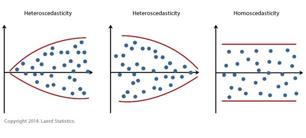
Note: these are in an idealised/very clear form. You will often see some tapering of points at either end of the main spread of points because there is usually less data at these places, but this is not usually something to worry about.
Let’s now produce the necessary plot and check for violation of this assumption:
- From the main menu go: Graphs > Scatter/Dot, then select Simple Scatter and click Define. Add the RES_1 variable into the Y Axis: box and the PRE_1 variable into the X Axis: box and click OK. Note: you can also get SPSS to make this graph via the Options menu in the General Linear Model Univariate tool, but it is a lot smaller and harder to see when made that way. What can we conclude?
Is the homoscedasticity assumption violated or not?
Read/hide
The spread of the residuals looks fairly even across all values of the model predictions for the outcome, so we can safely assume this assumption has not been violated.
What if there had been a clear pattern in the residuals when plotted against the model predicted values?
How to deal with heteroscedasticity
Read/hide
The first thing to do would be to try and find out why this was. This is usually either caused by 1) having an outcome that covers a very large range of values, because typically the variance will be greater at larger values, even if the model is correctly specified, 2) having an outcome that varies more at higher/lower values of a numerical covariate and/or varies differently between one or more categorical variable levels for whatever (genuine/real world) reason, or 3) having an incorrectly specified model, which means your model is either missing important and necessary non-linear term and/or interaction terms. This is beyond the scope of this module, but you can learn more about modelling non-linear associations and interactions via the materials on Minerva for the linear regression lecture.
Identifying scenario 2) and 3) involves exploring the association between the residuals and all covariates in turn to try and identify the culprits, and careful thinking about whether any key covariates may be missing from your sufficient adjustment set. While identifying scenario 1) involves ruling out scenario 2) and 3) and having an outcome with a large range of values (typically spanning a number of orders of magnitude).
How to solve this? If the problem appears to be due to scenario 3) you may be able to identify the culprit missing variable or missing functional form and update the model to solve the problem. If the problem involves scenario 1) or 2) then a simple and often sufficient solution is to use a linear regression model with “robust standard errors”, also known as “heteroskedasticity-consistent standard errors” or “Huber-White (robust) standard errors” (after the two inventors of the method). While we will not discuss or practice this solution further you can get an overview of how to run the method in SPSS here:
https://www.ibm.com/support/pages/can-i-compute-robust-standard-errors-spss
Step 4: consider additional possible issues (before interpreting the results)
No extremely influential observations
Sometimes single or multiple observations (individuals in our “SBP data final.sav” dataset) can have an excessive influence on the results, i.e. the coefficients and/or confidence intervals and p-values of your linear regression model, especially in smaller datasets. What this means is that including or excluding these observations from the analysis can change the results and potentially your overall interpretation of the results substantially. This is obviously not a good situation when the results are so sensitive to one or a few observations. If such observations exist in your model then you need to explore them and try and understand why they are so influential and whether they should be retained in the model. Observations can be influential in two main ways:
Outliers: observations can have a large residual value, i.e. an outcome value that is unusually larger or small given its covariate values.
Leverage: observations can have values for one or more covariates that are unusually large or small compared to all other values for that covariate.
Separately or together these two processes can give rise to observations that are highly influential. There are quite a few ways to explore these issues, but for time and simplicity we will just look at one widely used approach: the Cook’s distance (D) statistic. Without going into details for each observation in a dataset Cook’s D measures “how much” the values in a regression model change when that observation is removed from the model. Cook’s D starts at 0 with higher values indicating more influential observations. Various rules of thumb have been proposed for judging when a value of Cook’s D indicates that the observation should be looked at, but these may fail, and it is simpler and probably more robust to just judge (based on the type of graph we will produce below) whether any observations have a value of Cook’s D that is relatively much greater than all the other Cook’s D values. We already told SPSS to calculate Cook’s D as a new variable in the General Linear Model Univariate tool when we selected the Cook’s distance option in the Save options.
The easiest way to explore which observations appear to have excessively large values for Cook’s D is to create a scatterplot of Cook’s D against the observation ID variable (which is just a simple count from the first to the last observation).
Remember in the main menu we go: Graphs > Legacy Dialogues > Scatter/Dot. Then select the Simple Scatter option and click Define. Then add the Cook’s D variable COO_1 to the Y Axis: box and the id variable to the X Axis: box and click OK.
Remember you can interact with an SPSS graph by double clicking on it. We can then click twice on an observation to highlight it alone with a yellow circle, which allows you to then right click and select “Go to Case” to see that observation in the Data View. What do you see on the graph?
Interpreting Cook’s D values
Read/hide
One observation appears to have a clearly much higher value for Cook’s D than all the other observations. Interacting with the graph we can explore these observations, which has an ID of 520.
What do you notice about the outcome and/or covariate values for these observations?
What do you notice about these influential values?
Read/hide
Observation id 520 has a very large value for BMI of 41, but otherwise appears normal, so this is likely driving its influential power.
What should we do? Generally unless you can be certain that an observation is influential due to an error in the outcome or an covariate then you should not make any changes to these values nor should you exclude the observation from your primary analysis. However, a simple, transparent and widely recommended approach is to conduct a sensitivity analysis by removing such observations from the dataset (i.e. create a copy of the dataset and then delete them entirely) and re-running your analysis to see if the results change substantially. If the results do not change in any important way then you should report this lack of change following the removal of the observations, but include the sensitivity analysis results in an appendix etc so readers can verify the truth of this. If the results do change substantially then it makes most sense to report both sets of results in the main paper and interpret accordingly, i.e. be clear that the conclusions change depending on whether such extreme observations are included or not. Either way you must be transparent and open about their effects.
Step 5: understand the results tables and extract the key results
So now that we have verified that the assumptions of the model are not clearly violated, we can finally interpret our results. This is the really interesting and exciting part of any analysis! As you’ll have filled the output window with lots of graphs from the assumptions checking you may wish to re-run the linear regression again. Either way in the output window the results are presented in three tables.
The first table “Between-Subjects Factors” isn’t that useful (assuming we understand our data well), and just shows the number of observations in each level of each categorical variable. The second table “Tests of Between-Subjects Effects” shows an “ANOVA” table. This can be used to understand the “statistical significance” of each term (but only the overall term for categorical variables, not each level) in relation to how much variation it accounts for in the outcome variable. However, this is arguably of little value when our final table “Parameter Estimates” (which SPSS doesn’t provide by default!) provides us with both an estimate of the “statistical significance” (i.e. the p-value) of all terms including categorical variable levels, but also much more usefully it gives us the linear regression coefficient (i.e. the estimated direction and size of the association) and its 95% confidence interval for every covariate (or more specifically every term) in the model. Therefore, we will largely ignore the second table (apart from coming back to one piece of information it provides that should really just be in the “Parameter Estimates” table), and just focus on the “Parameter Estimates” table.
So what does it all mean?
Parameter estimates table columns explained
Parameter
- Each row indicates which term in the model the following results apply to. Terms are either the intercept or (in our case) main effects of covariates, or with more complicated models they may include interaction terms and/or non-linear terms like polynomial terms. For numerical variables this means one row per variable. However, because each level of a categorical variable is actually treated as a separate “dummy variable” (coefficient) as standard in a linear regression model each categorical variable level has its own row.
B
B stands for “betas”, because in the linear regression model when represented mathematically the coefficients are usually represented by the Greek letter beta. The betas are more commonly referred to as the linear regression parameter estimates or coefficients. They tell us the best estimate (point estimate) of the direction (positive or negative) and size of the association between each parameter in the regression model and the outcome variable.
For all numerical covariates they represent the expected mean change in the outcome variable for every 1-unit increase in the covariate.
For categorical variables it’s a bit more complicated. There are many different ways of looking at categorical variable effects, but the most common is called dummy coding, and this is the default presentation in SPSS and most (probably all) stats software. With dummy coding one level in the categorical variable (e.g. female in the variable sex) is set as the reference level. Then the coefficients for the other level(s) represent the expected mean difference in the outcome variable between each level and the reference level (e.g. male compared to female). Unfortunately (for no obvious reason) SPSS’s univariate general linear model tool does not display value labels for categorical variables in the “Parameter Estimates” table and so all you see are the numerical codes (you’ll have to check the value labels in the Variable View if you can’t remember the value coding). By default SPSS sets the level with the highest value as the reference level. You will notice that the reference level always has a coefficient value of 0, with a superscript letter “a” linking to a footnote explaining that “This parameter is set to zero because it is redundant”, i.e. it’s the reference level.
A note on the intercept. You may be wondering what the “Intercept” parameter represents? In a simple linear regression with just one covariate this corresponds to the Y-intercept (hence the name), i.e. where the linear regression line crosses the y-axis (and the covariate or x-value is 0). In a multiple linear regression this represents the expected/model predicted mean value of the outcome when all numerical covariates have a value of 0 and all categorical variables are at their reference levels. Therefore the intercept will rarely have any useful interpretation (e.g. it assumes BMI = 0) and is usually ignored as a necessary but informative structural part of the model (unless you centre your variables, which we will not be looking at here).
Std. Error
- This is the standard error of the coefficient, which is an estimate of the sampling variability of the coefficient in the target population. This is used when calculating the 95% confidence intervals and p-value, but you can ignore these and just interpret the 95% confidence intervals and (if you wish) p-values.
t
- This is the t-statistic for the coefficient and is used when calculating the confidence intervals and the p-value associated with the coefficient. You can calculate 95% confidence intervals and p-values assuming normally distributed data, but using the t-distribution is more conservative (safe) for small sample sizes and is equal to assuming normally distributed data at large sample sizes. You can ignore these and just interpret the 95% confidence intervals and (if you wish) p-values.
Sig.
- This is the two-tailed (although now it doesn’t mention that explicitly!) p-value associated with each coefficient. Again, assuming the “true” value of the coefficient in the target population is 0, the p-value represents the probability of observing a coefficient at least as great as that observed (positively or negatively as it’s a two-tailed p-value) due to sampling error alone.
95% Confidence Interval (Lower Bound and Upper Bound)
- These are the lower and upper 95% confidence intervals for the coefficient based on the t-distribution. As usualy, loosely speaking they represent a range of values that we can be reasonably confident contain the “true” coefficient that exists in the target population.
Then lastly if we go back to the “Tests of Between-Subjects Effects” table and look at the footnotes we see one footnote: “a. R Squared = X (Adjusted R Squared = X)”. In a linear regression model the R² value represents the proportion (or % if you multiply it by 100) of variation in the outcome variable that is explained by the model, i.e. by all the terms of variables in the model. However, whenever you add a term to a model the R² value will increase even if the term is a random number variable, and has no true explanatory power for the outcome. Therefore, it is better to use the adjusted R2 value which makes a correction for the number of variables in the model. Note, R² values in health sciences are rarely as high as the one seen here, which is due to the artificial nature of the data.
Therefore, typically we are just interested in the key descriptive statistics about the sample (number of observations and missing values, which are more easily obtained via separate descriptive analysis of the dataset), and in terms of the inferential results we want the parameter or coefficient estimates, their associated 95% confidence intervals (and possible their associated p-values), and often also the R² value of the model.
Step 6: report and interpret the results
Numerical covariates
As we’ve looked at the association between a numerical covariate and our outcome let’s consider how to interpret associations in general between numerical covariates and continuous outcomes via linear regression. In the next exercise we’ll look at categorical covariates.
Statistical interpretation
For numerical covariates linear regression coefficients represent the model-predicted mean (or more loosely the average) change in the outcome (i.e. in units of the outcome) for every 1-unit increase in the covariate’s units, while holding the effect of all other covariates constant, i.e. they measure the mean independent association. Note: this change does not depend on the value of the covariate, i.e. the same association is assumed to exist across the full range of values that the covariate can take in the sample data, but it should not be considered to hold if you were considering values of the covariate outside of the range of values seen in the sample data.
Looking at bmi in the parameter estimates table the point estimate (i.e. the single best estimate) of the regression coefficient is 4.2. This means that, based on the model, the point estimate of the association between age and systolic blood pressure in the target population is that for every 1-unit increase in bmi, i.e. for every 1 kg/m2 higher on the bmi scale that a participant is, the model indicates that the expected mean systolic blood pressure is 4.2 mmHg higher. If you were adjusting for other covariates, typically in the context of trying to estimate a causal association, then this interpretation would be whilst holding the effect of all other covariates constant.
However, how sure can we be about the true direction and size of the regression coefficient (i.e. the association of interest) in the target population given our sample size and the sampling error in the sample? This is what our confidence intervals help us to estimate. Remember, formally they provide a range of values that, hypothetically speaking, if we were to repeat our study and analysis many times (technically an infinite number of times), would contain the true value of the regression coefficient in the target population X% of the time, where the true value of the regression coefficient would be the value of the regression coefficient that we would get if we measured every individual in our target population and ran the model, and X% is the confidence level (typically 95%). Informally and more loosely speaking a 95% confidence interval around a regression coefficient gives us a range of values that we can view as likely including the true value of the regression coefficient that exists in the target population (but we can’t say within that range which values are more/less likely).
Therefore, in the parameter estimates table we can see that the 95% confidence intervals for the regression coefficient for bmi are 3.8 and 4.6. Consequently, we can be reasonably confident that the true value of the regression coefficient (i.e. the true linear slope) in the target population is between 3.8 and 4.6. And so because the 95% confidence intervals are fairly narrow we can conclude that we have obtained a reasonably accurate estimate of the likely association between age and systolic blood pressure in the target population. However, as always this is assuming there is no bias in the results, which in a real study is very unlikely, and therefore in a real study we must consider all likely sources of bias and their likely impacts when assessing the inferential results!
Practical importance
Now we know how to interpret the result statistically how do we interpret its real-world practical importance? For example, what can we conclude about its importance clinically and for public health programmes? These are complicated questions that have no simple answers and different people will have differing views depending on their views of the evidence (result) and the wider context. Most importantly you need to think carefully and critically and have strong subject matter knowledge to make robust interpretations and suggestions/recommendations. However, we can give some guidance about things to consider. You should clearly consider whether individuals or other units of observation can have their values of the covariate of interest moved or not, and what this implies for what clinical practice and public health programmes etc can or cannot do about that the characteristic represented by that covariate. For example, an individual cannot alter their height, while their age changes but out of their control, but their bmi can be affected by themselves or outside influences (e.g. interventions).
For example, our regression coefficient for bmi is 4.2, so clinically it appears that even slightly lower values of bmi are associated with quite big negative differences in expected mean systolic blood pressure of individuals. So practically it looks like it may make sense to focus intervention efforts on individuals with higher bmi, but take care as this is not necessarily a causal association.
Another thing to consider when interpreting the associations and their implications is the range in bmi values for individuals in the sample. Here bmi range from 17.8 to 41. So does it make sense to make statistical inferences about the association between bmi and systolic blood pressure for individuals with values of bmi outside of this range? Almost certainly not.
Exercise 2: describe the population-level association between socio-economic status and systolic blood pressure using linear regression (assuming a linear association)
Step 1: explore the data
Categorical covariates
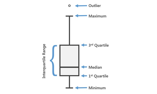
Now let’s see how to visually explore the association between categorical variables and a numerical outcome. To do this we can use bar charts or boxplots. Boxplots are probably better as they provide more information within the plot, although you can present much of the same information on a barchart if you know how using statistical software like R. Why would we want to do this, given you cannot have a non-linear association between a categorical variable and a numerical outcome? The main reason would be to inform us whether any levels within categorical variables might be suitable for merging/pooling together if necessary, and to understand whether the variance within category levels is approximately equal, which is a key assumption of linear regression.
- Look at the figure below to understand how to interpret boxplots:
Let’s look at the association between the outcome and the categorical variable socio-economic status with a boxplot:
- From the main menu go: Graphs > Legacy Dialogues > Boxplot, then select Simple and click Define. Add the sbp variable into the Variable: box and ses into the Category Axis: box and click OK. What do you see?
What does the association between socio-economic status and systolic blood pressure look like?
Read/hide
It looks like systolic blood pressure may be slightly lower on average as you move from low to medium to high socio-economic status.
Step 2: run the regression model
Repeat the above steps for exercise 1 step 2 but instead of adding bmi as the covariate when setting up the model add the ses socio-economic covariate.
Step 3: check the assumptions
The assumptions remain the same as for exercise 1. The only difference is now the residuals are grouped. So instead of looking for homoscedasticity in relation to an even “spread” of our residuals vs a continuous covariate we can use a boxplot, as in step 1, to view whether the spread of residuals is approximately the same in each group.
We can also repeat the same process to look at the spread of the residuals vs the model predicted values, but we’re again looking for equal spread within each group of the covariate.
Step 4 remains the same as for exercise 1, so we can repeat the same process.
Step 5: understand the results tables and extract the key results
You can see the full details of what the tables contain in general back in exercise 1 step 5, but the key results are again the regression coefficients and their confidence intervals, which are contained in the “Parameter Estimates” table.
So again, let’s focus on the regression coefficients, which are in the “B” column, and their confidence intervals, which are in the “95% Confidence interval” set of two columns. We have four regression coefficients in the “B” column. We can see the “B” in row 1 is the intercept, so that’s not necessarily of interest, although here it represents the mean systolic blood pressure (mmHg) when the ses variable = 3. SPSS doesn’t make this particularly easy to work out, but we can see which level of the ses variable has been treated as the reference level by looking for the regression coefficient that has a valud of 0, and a superscript a linked to a footnote saying “This parameter is set to zero because it is redundant.” This is not very clearly telling us that ses = 3 has been taken as the reference level.
If we look at what the ses variable coding (e.g. right click on the variable in the “Data View” and click “Variable information”) we can see that ses = 1 = low, ses = 2 = medium and ses = 3 = high. So currently ses = high is the reference. Therefore, we can interpret the parameter estimates as follows. In the “ses=1” row we can see a “B” value of 6.013 with 95% confidence intervals of 1.5 and 10.5. This is telling us that in the sample individuals in the lowest socio-economic group have systolic blood pressure values that are on average 6 mmHg higher than individuals in the highest socio-economic group, and in the target population we sampled from the true difference in the mean systolic blood pressure for low socio-economic status individuals compared to high socio-economic status inidividuals is likely to be between 1.5 and 10.5.
We can also see that in the “ses=2” row we can see a “B” value of 1.895 with 95% confidence intervals of -3.072 and 6.863. This is telling us that in the sample individuals in the medium socio-economic group have systolic blood pressure values that are on average 1.895 mmHg higher than individuals in the highest socio-economic group, but in the target population we sampled from the true difference in the mean systolic blood pressure for medium socio-economic status individuals compared to high socio-economic status inidividuals is likely to be anywhere between -3.072 and 6.863 (i.e. we’re not even clear if the difference is positive or negative, let alone it’s likely magnitude).
Step 6: report and interpret the results
We can report these results in the same way as illustrated for exercise 1 step 6.