The chi-square test of independence
Overview
While the independent and paired t-tests allow us to analyse the association between a numerical outcome and a binary covariate, the chi-square (or chi-square) test of independence allows us to analyse whether there is an association between a categorical outcome (with any number of category levels) and a categorical covariate (again with any number of category levels), in terms of whether the relative frequency of observations across category levels in the outcome differs depending on the category level of the covariate. It’s probably called the chi-square test of independence because it uses the chi-square distribution and the inferential part of the test is a hypothesis test where the null hypothesis is that no association exists between the outcome and covariate, i.e. that they are independent.
For example, assume we are interested in whether there is an association between hypertension (a binary outcome) and socio-economic status, defined as having three levels: low, medium and high. Here for our purposes of illustration we don’t define these levels further, but in a real study they would be based on some, usually multivariate, computation/analysis. Statistically, we would be interested in whether the relative frequency (i.e. proportion/percentage) of hypertension differed depending on whether individuals were classed as being of low, medium, or high socio-economic status. This type of analysis could then be done using a chi-square test of independence (also called Pearson’s chi-square test after the inventor of the method, or the chi-square test of association), but note that the two categorical variables can have any number of levels.
The chi-square test of independence is still quite popular for such situations, which is why we are covering it, but it does have some big limitations and we’ll see later how to use a much more useful approach is logistic regression. Note: although the p-value calculated for the test is based on the chi-square distribution the test itself does not assume the underlying data follow any specific distribution and so it is technically a non-parametric test.
Scenario
Using the “SBP data final.sav” dataset we’ll analyse whether there is an association between individuals’ hypertension status (hypertension/no hypertension), based on having a systolic blood pressure <140 mmHg or ≥140 mmHg, and their sex (asumed to just be male/female), and then you can try a similar analysis by yourself.
- Load the “SBP data final.sav” SPSS dataset.
Step 1: check the assumptions of the chi-square test of independence
1. Both the outcome and the covariate should be categorical (either ordinal or nominal), each having at least two levels
This is clearly the case.
2. Observations should be independent
As with the independent t-test observations should not be related/correlated, such as would be the case if observations are collected from entities within clusters, such individuals clustered within families, health facilities or other institutions etc. Again, the only way to verify this is from a full understanding of the study design and data collection processes. Here we can assume this holds because the data come from a simple random survey of separate individuals.
3. Ideally no cell has an expected frequency less than 5 and no cells have expected values of 0
We can only check this assumption from the results once we’ve run the test. As we’ll see below cells are just the cross-classified category levels between the outcome and covariate. For example, if the outcome is hypertension (hypertension/no hypertension) and the covariate is sex (female/male) then you would have four cells: yes-female, yes-male, no-female, and no-male. We’ll also see below what the “expected” values are.
Note: this is not really a formal rule and other researchers provide other thresholds such as no expected frequency less than 10. However, when any expected cell frequency is less than 5, particularly when there are few category levels in both outcome and covariate (e.g. with a “2 x 2 contingency table” where both variables just have two levels), some researchers recommendation applying “Yates’s correction” (named after its creator) that aims at correcting the error introduced by assuming that the discrete probabilities of frequencies in the table can be approximated by a continuous distribution (chi-square). However, this has been shown to result in overly conservative hypothesis tests and so other researchers prefer to use Fisher’s Exact test, which is what we will mention here later. Remember you can always do a sensitivity analysis: run both versions and present both and interpret in terms of any differences.
However, if any cells have expected values of 0 you must merge the relevant category level in the covariate with one or more (logically chosen) category levels to ensure no expected values are 0. For example, if our outcome was hypertension status (hypertension/no hypertension) and our covariate was socio-economic status (low/medium/high) and we found that our “hypertension status = no, socio-economic status = low” cell had an expected frequency of 0 you could merge the low socio-economic status level with the medium socio-economic status level and see if that solved the problem.
Step 2: run the chi-square test of independence
Video instructions: run the chi-square test of independence
Written instructions: run the chi-square test of independence
Read/hide
Let’s run the test. First, load the “SBP data final.sav” dataset. From the main menu go: Analyze > Descriptive Statistics > Crosstabs. Then in the Crosstabs tool add the htn variable to the Row(s): box and the sex variable to the Column(s): box. Note: you can put either variable in either box and it doesn’t make any difference to the actual chi-square test of independence p-value, which is the only inferential statistic we get, but the cross-tabulated frequencies and percentages will just be presented “the other way around” from how I will produce and describe them, and the way I choose seems most logical to me, but you may disagree. Then click the Statistics button and tick the Chi-square box at the top-left, and then also tick the Phi and Cramer’s V box under Nominal (we’ll explain what these are later), then click Continue.
Let’s also edit the options for the descriptive tables that SPSS will produce, so we can see the observed and expected counts and frequencies (as percentages). Click the Cells button and under Counts ensure Observed and Expected are ticked, and under Percentages ensure Row, Column and Total are ticked.
Let’s also produce some clustered bar charts to help us interpret the results visually, which SPSS helpful allows us to do via the tool by ticking the Display clustered bar charts box.
Finally click OK.
Step 3: understand the results tables and extract the key results
In the output window you’ll see four tables and a bar chart. The first table titled “Case Processing Summary” just tells us how many “cases” were included or excluded in the analysis. A case represents an observation, which in our dataset represents a separate participant who had data on both categorical variables. So for example if a participant lacked data for either their hypertension status or their sex (or both) they would be excluded from the analysis. We can see none (0%) of the observations (participants) had to be excluded due to missing values.
We will skip the second table for now and next look at the third table down titled “Chi-Square tests”. This primarily gives us the inferential result for our chi-square test of independence, which is just in the form of a p-value from a hypothesis test that you interpret along side the point estimates of the outcome frequencies in each group of the covariate. Note: in addition to the chi-square test of independence we also get (without asking) results from some other related tests that we won’t consider further, and in the final row of the table we get the total number of valid (i.e. non-missing) cases again. Just look at the top row (Pearson Chi-Square) for the results from our chi-square test of independence.
What does it all mean?
Chi-Square tests section columns explained
Value
- This gives us the test statistic which is the chi-square (χ2) test statistic. It is used to compute the p-value, but you can ignore the value of the test statistic itself.
df
- This is the degrees of freedom (df) for the test/p-value. It represents a measure of how many pieces of statistical information (observations) were freely available for the test. You can ignore this.
Asymp. Sig. (2-sided)
This is our chi-square test of independence two-sided p-value. “Asymp. Sig. (2-sided)” stands for asymptotic significance (2-sided). This two-sided (or two-tailed) part means the p-value is computed on the assumption that the association between the outcome and covariate could be in either direction, while the “asymp.” part means that the rest assume an infinite sample size. The infinite sample size assumption is obviously not true but may be a reasonable and useful approximation. What represents a “reasonable sample size” isn’t easy to work out, but rough rules of thumb (a “rule of thumb” is an English language saying for a rough guide) usually say at least >30 observations and no cell with <5 observations.
As you can see our chi-square test of independence p-value is 0.000 (i.e. <0.001 as if you remember SPSS does not give exact p-values once P<0.001). This is lower than the standard 0.05 threshold for claiming “statistical significance”.
We can actually ignore the remaining two columns: “Exact Sig. (2-sided)” and “Exact Sig. (1-sided)”. This is because as they don’t apply to our test, only if you were interested in the results of “Fishers Exact test”.
Note: see the footnotes to the table. One reads “0 cells (0.0%) have expected counts less than 5…”, which means that this assumption of the test was not violated and so we can interpret our results.
Now let’s come back to the second table titled “Hypertension (SBP >= 140 mmHg) * Sex (male/female) Crosstabulation” where this information comes from and understand it.
Hypertension (SBP >= 140 mmHg) * Sex (male/female) Crosstabulation table explained
This is a cross tabulation showing us a range of statistics for each cell, where each cell is defined by one of the unique combinations of the two categorical variables’ levels (i.e. with two binary categorical variables we have 2x2 = 4 cells: htn = yes and sex = male, htn = yes and sex = female, htn = no and sex = male, and htn = no and sex = female). In addition the total value of each statistic is presented within each level of each categorical variable across the levels of the other categorical variable (e.g. the total for htn = no across both sex = male and sex = female). Within each cell we have the following statistics/values:
Count
- The number of observations (participants) in each cell.
Expected Count
- The expected number of observations calculated using the formula: (row total x column total) / overall total. This calculated the expected number of observations per cell if there was no association between the two variables.
% within Hypertension (SBP >= 140 mmHg)
- This is the % of observations (relative frequencies) within each level of hypertension for the relevant level of sex.
% within Sex (male/female)
- This is the % of observations (relative frequencies) within each level of sex for the relevant level of hypertension.
% of Total
- This is the % of observations (relative frequencies) within each cell out of the total number of observations.
So it’s quite a complicated table to say the least to look at initially, but it’s crucial for interpreting the results of the test fully. In particular we need to look at the relative frequencies within each level of one of the categorical variables for the levels of the other variable to understand the strength and direction of possible associations between the variables, as reported in the example results reporting text above. These are the “% within Hypertension (SBP >= 140 mmHg)” and “% within Sex (male/female)” values. Let’s work through both sets of relative frequencies. For ease of understanding we have reproduced the table below. If yours looks different then it’s not necessarily wrong but you may have put the variables in a different way around, so you may wish to go back and follow the instructions above more carefully to recreate the results as they look below.
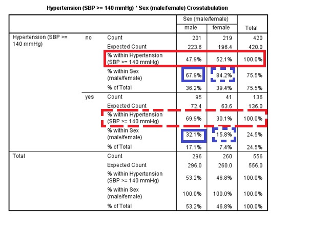
Because of the way the table is laid out (with sex along the top and htn down the side) it makes most sense to look at the results from the “point of view” of the htn variable, looking at the relative frequency of men and women for each level of htn. So to do this with the above table we are looking across the rows at the “% within Hypertension…” values. First look at the row outlined in solid red for htn = no. This tells us that out of the individuals who were htn = no 47.9% were men and 52.1% were women. Next look at the row outlined in dashed red for htn = yes. This tells us that out of the individuals who were htn = yes 69.9% were men and 30.1% were women. Therefore, there appears to be a strong association between hypertension status and sex, with men being more likely to be hypertensive than women, i.e. as we “move” from one level of htn to the other the relative frequency of sex varies substantially from roughly 50%:50% to roughly 70%:30%. We can also look at these results from the “point of view” of the sex variable, but now because of the way the table is laid out it makes more sense to look down the sex level columns or reproduce the table with the variables the other way around. Look at the values outlined in solid blue in the male column. These show us that of the individuals who were men 67.9% were not hypertensive and 32.1% were. Finally look at the values outlined in dashed blue in the female column. These show us that of the individuals who were female 84.2% were not hypertensive and 15.8% were. So again it indicates the same direction and strength of association, because it’s the same data, but looking from “the point of view” of the other variable. I find looking from the “point of view” of the assumed outcome variable more logical and intuitive (i.e. the first “view”) because it’s the assume causal relationship, but you may disagree.
Lastly we come to the fourth table “Symmetric Measures”. This presents the Phi and Cramer’s V statistics and their associated p-values. The statistics both measure the strength of the association between the two variables in the analysis, and both go from 0 (no association) to 1 (“perfectly” associated). The associated p-value shows you, assuming the Phi/Cramer’s V value is 0, how likely you were to observe a value at least as great as the one observed due to sampling error alone. These statistics can help you interpret how strong any association is, but they are difficult to interpret. When both variables have two levels then they are equivalent in interpretation to a linear correlation coefficient with a simple and useful interpretation (the strength of association on a 0-1 or 0-100% scale), but when there are more than two levels in one or both variables there’s no clear intuitive interpretation!
Therefore, I would recommend firstly looking at the p-value to see if there is any reasonable evidence for an overall association between your two categorical variables (i.e. based on the standard P ≤ 0.05 threshold), and the looking at the relative frequencies (% of observations within different levels of one variable for each level of the other) as we have done above to judge where any associations might exist, in what direction and how strong they appear to be.
Step 4: report and interpret the results
In our methods section we would explain that we used a chi-square test of independence and justify why we did so. Then in a results section we could say something like:
Among males 67.9% (201/296) of individuals had hypertension (systolic blood pressure ≥140 mmHg) while among females 84.2% (219/260) of individuals had hypertension. A chi-square test of independence showed that this represented a statistically significant association between hypertension and sex (P<0.001).
This allows readers to understand the direction and possible size of associations between the relative outcome frequencies in each of the covariate’s groups, and the associated inferential hypothesis test p-value result, which loosely speaking gives us a sense of how confident we can be in concluding that the exact observed association in the sample represents the association that exists in the target population.
Limitations
The main limitation of the chi-square test of independence is that we do not get any confidence intervals on our raw measures of effect size: the relative frequencies (i.e. the raw measure of the direction and strength of the association). We only get an overall p-value that tells us, assuming there is no association between the two categorical variables, how likely we are to have observed an association (in either direction) at least as great as the one we have observed due to sampling error alone. So all it can indicate is if there is likely to be an overall association between the two variables given the uncertainty in the data. It tells us nothing about the direction or size of any association, or which levels it involves.
When both variables have two levels, like with our example, we know any association must be between both levels of each variable. However, when there are more than two levels in one or both variables it’s even less clear. For example, assume we looked at the association between the htn and ses variables. If we found the p-value for a chi-square test of independence was < 0.05 we could conclude there was evidence for an overall association. However, we could get a significant p-value if the relative frequency of hypertension was similar for two levels of ses and only differed for the remaining level, or we could get a significant p-value if the relative frequency of hypertension was different among all three levels of ses. Therefore, all we can do is conclude whether there is evidence for an overall association based on the p-value, and then cautiously interpret the relative frequencies (measures of effect) to see which levels, what direction and what size of associations appear to exist. As you can see this is much, much less robust and satisfactory than having confidence intervals for our raw measures of effect size.
Expected cell counts <5
What if one or more of our expected cell counts are <5? Then we can use a similar test that can deal with this problem (but is typically less powerful when it’s not an issue) called the Fisher’s Exact test. To include this test in our chi-square results table when we go to the Crosstabs tool add in the variables as above but now click the Exact button and then tick the Exact button (you can leave the Time limit per test as it is). Then click OK and in the Chi-Square Tests table you will see an additional row called Fisher’s Exact Test. Again all we get is a two-sided p-value (“Exact Sig. (2-sided)”) based on the test statistic (“Value”) given the degrees of freedom (“df”), which as always just tells us, assuming the null hypothesis is true, how likely we were to have observed data reflecting an association that differed from the null hypothesis at least as greatly as that observed.
Exercise: chi-square test of independence
Using the “SBP final data.sav” dataset and via the process outlined above use a chi-square test of independence to analyse the association between BMI and ACE inhibitor usage during the past three months, with the hypothetical research question being is BMI related to ACE inhibitor usage?
First convert the BMI variable into a binary variable based on BMI values <30 kg/m² and those ≥ 30 kg/m².
Run the chi-square test of independence using the new categorical variable BMI (<30 kg/m² or ≥ 30 kg/m²) and ace.
Hint: enter your new categorical BMI variable into the Row(s): box in the Crosstabs tool and then in the Crosstabulation table look across the top and bottom halves of the table. For example, the top half of the table will, depending on how you’ve coded your BMI categorical variable, include the count (frequency) and % of individuals who reported (yes) and did not report (no) using ACE inhibitors during the past month within the relevant BMI group. You can then compare the frequency and % of individuals reporting usage between the two BMI groups, along with the chi-square p-value result in the following table.
In the MSc & MPH computer practical sessions files “Exercises” folder open the “Exercises.docx” Word document and scroll down to Chi-square test of independence: the relationship between BMI and ACE inhibitor usage.
Write a couple of sentences reporting the results of your analysis. Include the basic descriptive statistics: overall sample size and frequency and proportion/percentage of individuals with low and high BMI who reported using ACE inhibitors during the past three months. Also be sure to include sufficient details about the type of analysis used, and of course the key inferential result. Round results to one decimal place. You don’t need to explain anything about the study or interpret the clinical or practical importance of the result.
Write a sentence or two about the key limitations of this analysis in terms of interpreting the result.
Once you’ve completed this compare your reporting to the below example text.
Example results reporting text
Read/hide
I analysed the association between BMI, defined/grouped as <30 kg/m² or ≥30 kg/m², and ACE inhibitor usage during the past three months. Out of a total sample size of 529 individuals, among individuals with reported BMI values <30 kg/m² 4.7% (20/429) reported using ACE inhibitors during the past three months while among individuals with reported BMI values ≥ 30 kg/m² 7% (7/100) reported using ACE inhibitors during the past three months, but this difference was not statistically significant (P = 0.3) based on a chi-square test of independence. Therefore, there was no clear evidence for an association between BMI when grouped as <30 kg/m² or ≥30 kg/m² and ACE inhibitor usage frequency during the past three months in this target population. However, the key limitation of this analysis is that it does not adjust for any other confounding variables, of which there are likely to be many (especially in an observational cross-sectional study like this). Therefore, this is likely to represent a biased estimate of the independent association between BMI (as defined/grouped here) and ACE inhibitor usage within the past three months in this target population.